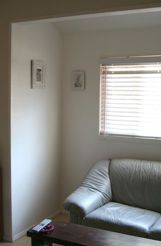
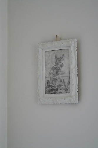
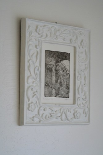
Bare, but bright. I used a trick from Martha Stewart and juxtaposed three nearly matched shades of white for a sort of pearlescent, light-bending effect. This color was originally intended for the bathroom, but I made a mistake when I picked out the color for this nook, and it has been garish orange for most of the year. I found the white paint I’d set aside last year and decided to dive in and cover up the nook. I painted the frames to match, then stapled bookbinding tape to their backs to hang from the hooks. The frames came from a thrift jaunt with Jenn last year. One was originally hot pink.
I have a beautiful collection of prints from Aegean Center alumni, and one by one I’m getting them hung. I’ve collected a bunch of frames in useful sizes and am painting them all to match. I’ll admit, after years of living in boring white apartments, I am a little bummed about the monochrome design scheme, but it seems to work without being cold.
“Donkey Dusk” by Seamus Heffernan
“Old Venetian” by Mark Dunstan


WOW! that looks GREAt!!
i cannot wait to see the house. it looks like you’ve been working so hard on it! yay! i’m so excited for you!
and i don’t think the white looks boring. i think it look like a blank canvas. perfect for you, who creates art with every breath.